
Project Title: Angel City FC – Home Page Redesign
Web Designer + UX Strategist
Sports Club, Brand-Aligned Experience
The Problem
Angel City FC needed a homepage that reflected more than just a sports team — they wanted a movement-forward design that showcased empowerment, energy, and identity beyond the field.
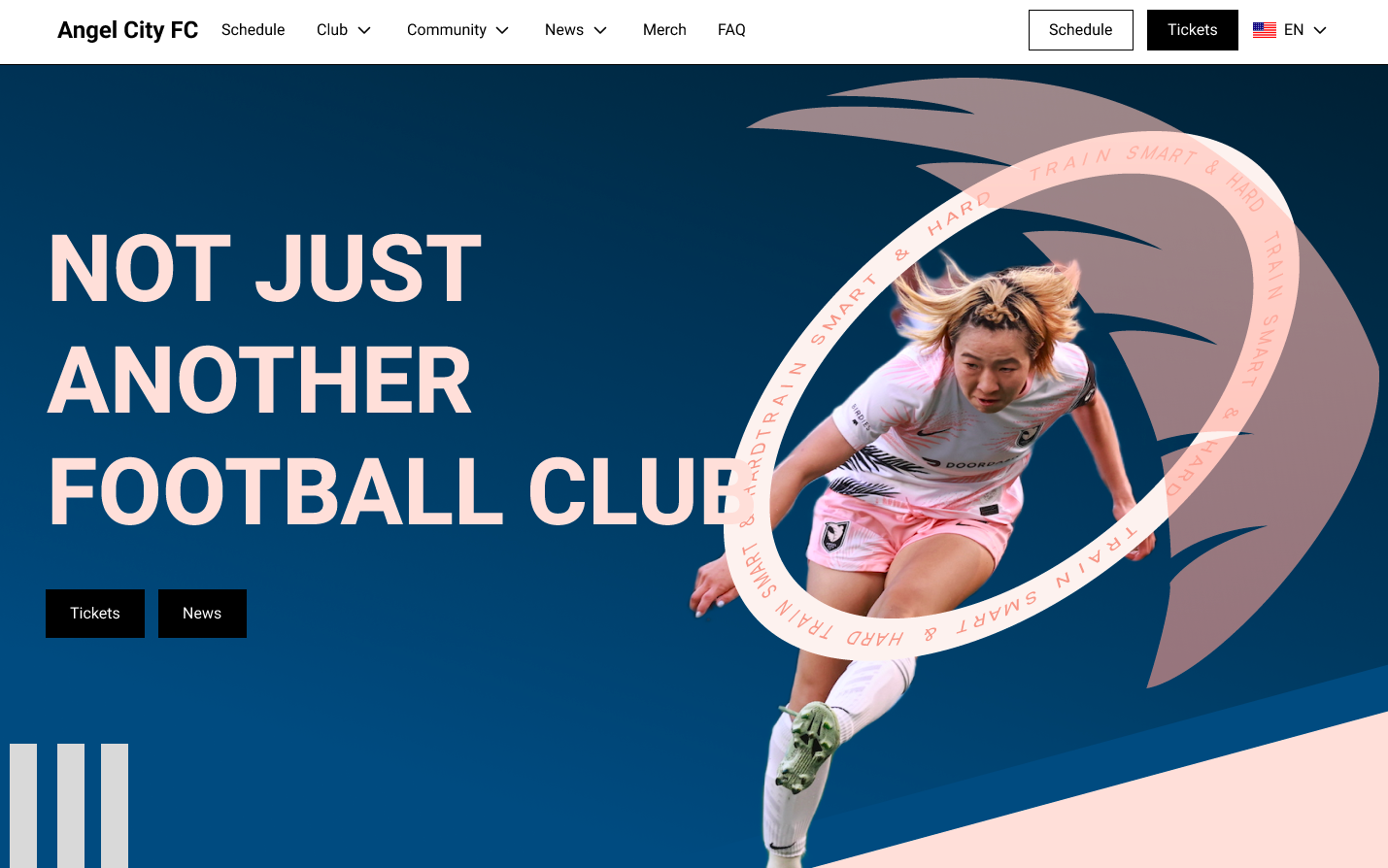
“Final hero section emphasizing movement and brand messaging. CTA placement and typography support conversion and engagement.”
Design Objectives
- Create a high-impact hero that immediately grabs attention
- Use visual movement and typography to communicate energy
- Make primary actions (Tickets, News) feel seamless and intentional
- Showcase how a sports brand might extend into digital and interactive spaces
Design Approach
- Typography: Large, bold sans-serif headline sets the tone with confidence
- Imagery: Motion and determination are conveyed through a dynamic player cutout, overlaid with a motion ring to simulate depth and movement
- Brand Detail: Integrated graphic textures and curved text to echo club branding while feeling fresh and modern
- UX Consideration: Clear CTAs at the hero level to support direct interaction for events or content access
- Accessibility: Made sure all calls to action were visually distinct and keyboard accessible.
Reflections
This project was a personal exploration in brand adaptation and cross-genre design thinking — imagining how a traditional sports team could evolve for virtual events and interactive fan experiences.
Tools Used
- Figma (wireframing + high-fidelity)
- Adobe Photoshop (image cutout + effects)
- Webflow (optional if you did a prototype)